

The client
Evome Consulting is a coaching practice focused on personal and professional development. Its approach places emotions and human connection at the core, guiding individuals through processes of self-discovery and the exploration of their potential.
The brief
To create an identity that communicates security, clarity, and collaboration, reflecting the bond between coach and client. The design needed to combine a professional, sophisticated image with a human, accessible, and approachable quality.
The design
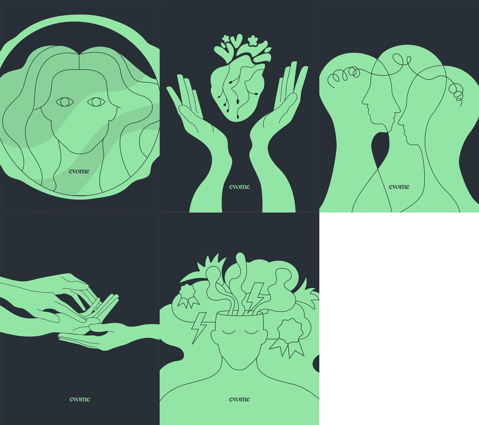
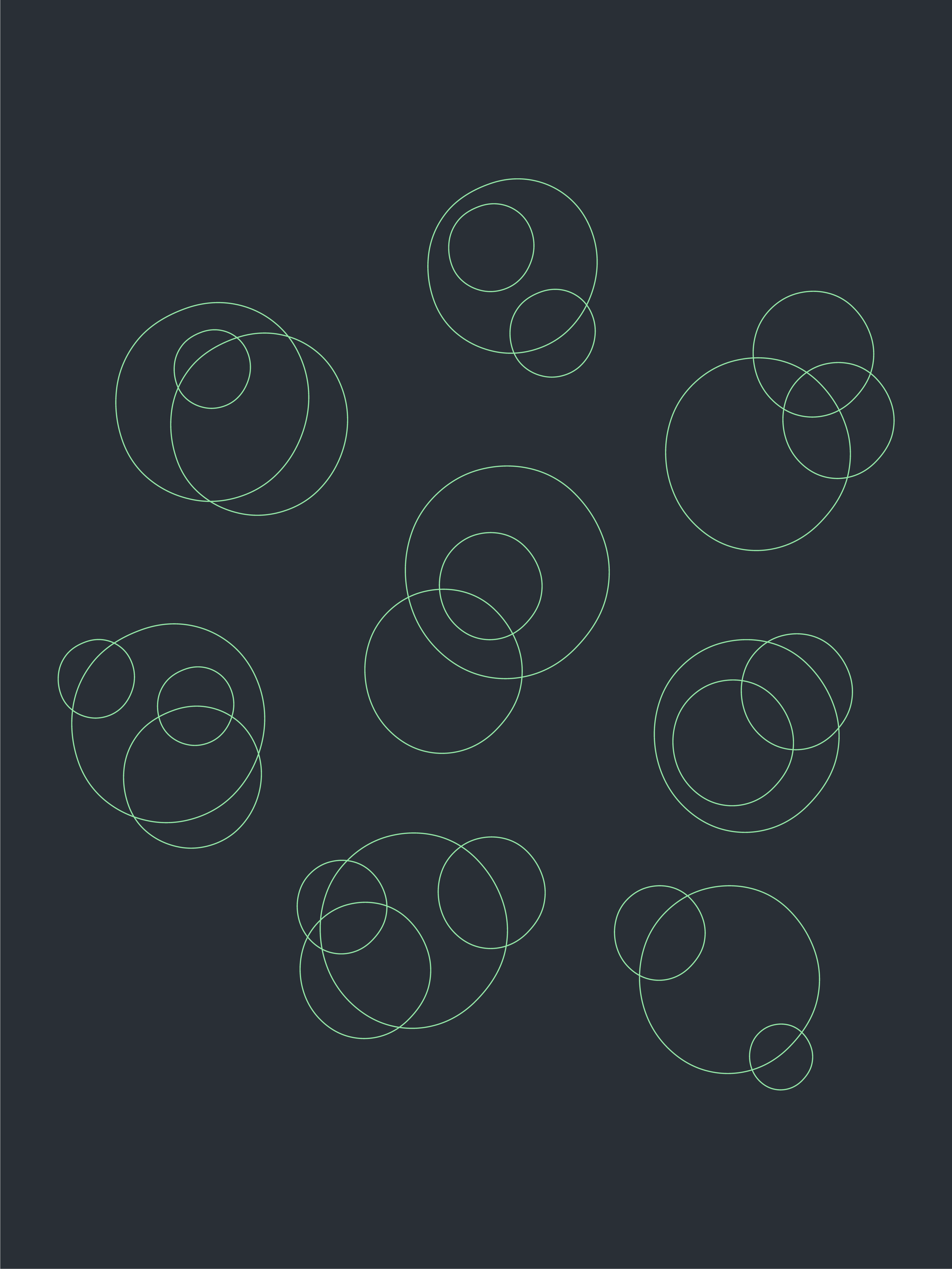
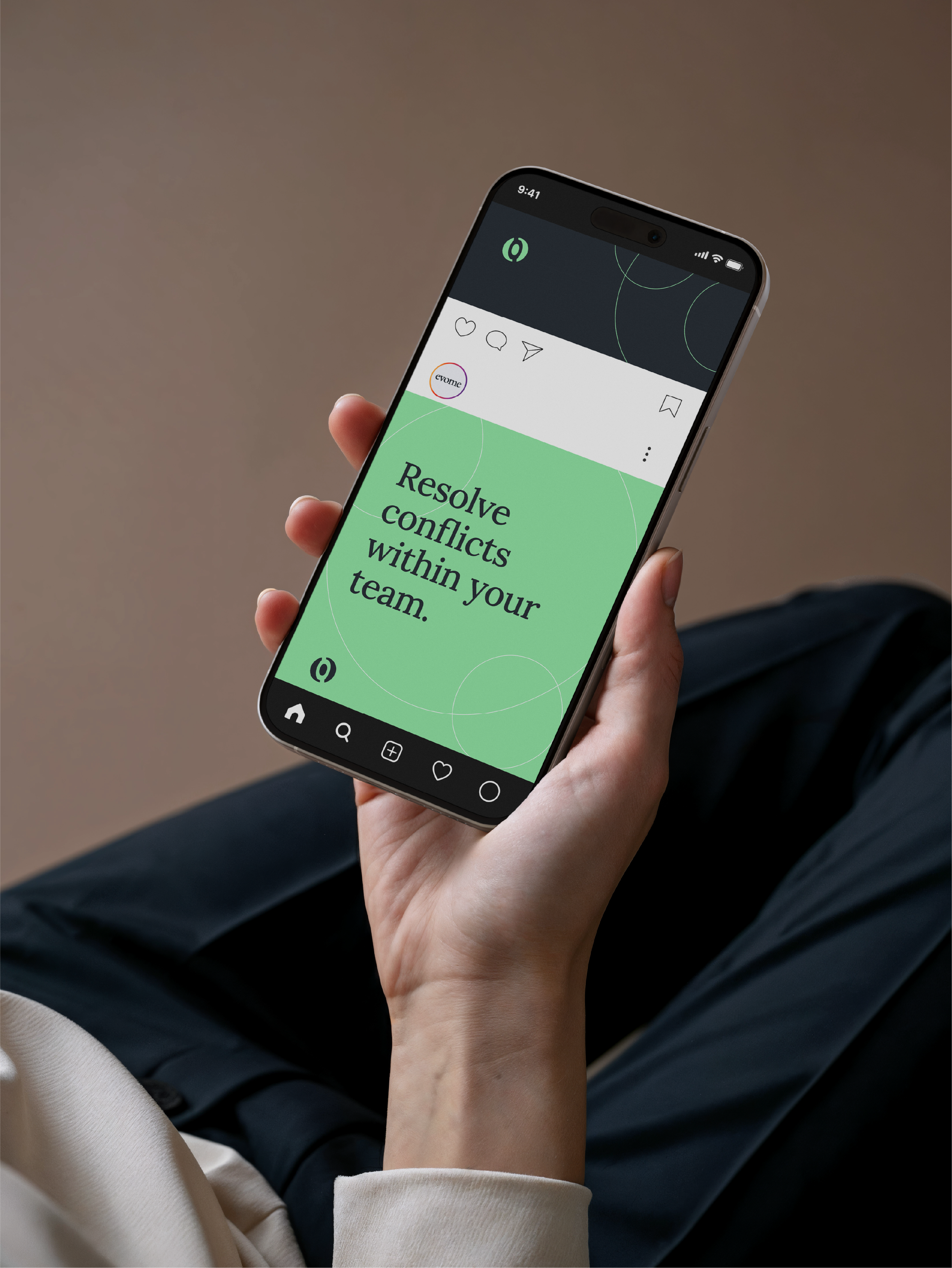
The concept of connection was translated into the visual system through simple, enveloping shapes. The treatment of the letter "o" in the logo and the accompanying icon reinforces the idea of connection and partnership. Illustrations were incorporated to visually communicate the brand's content.
The strengths
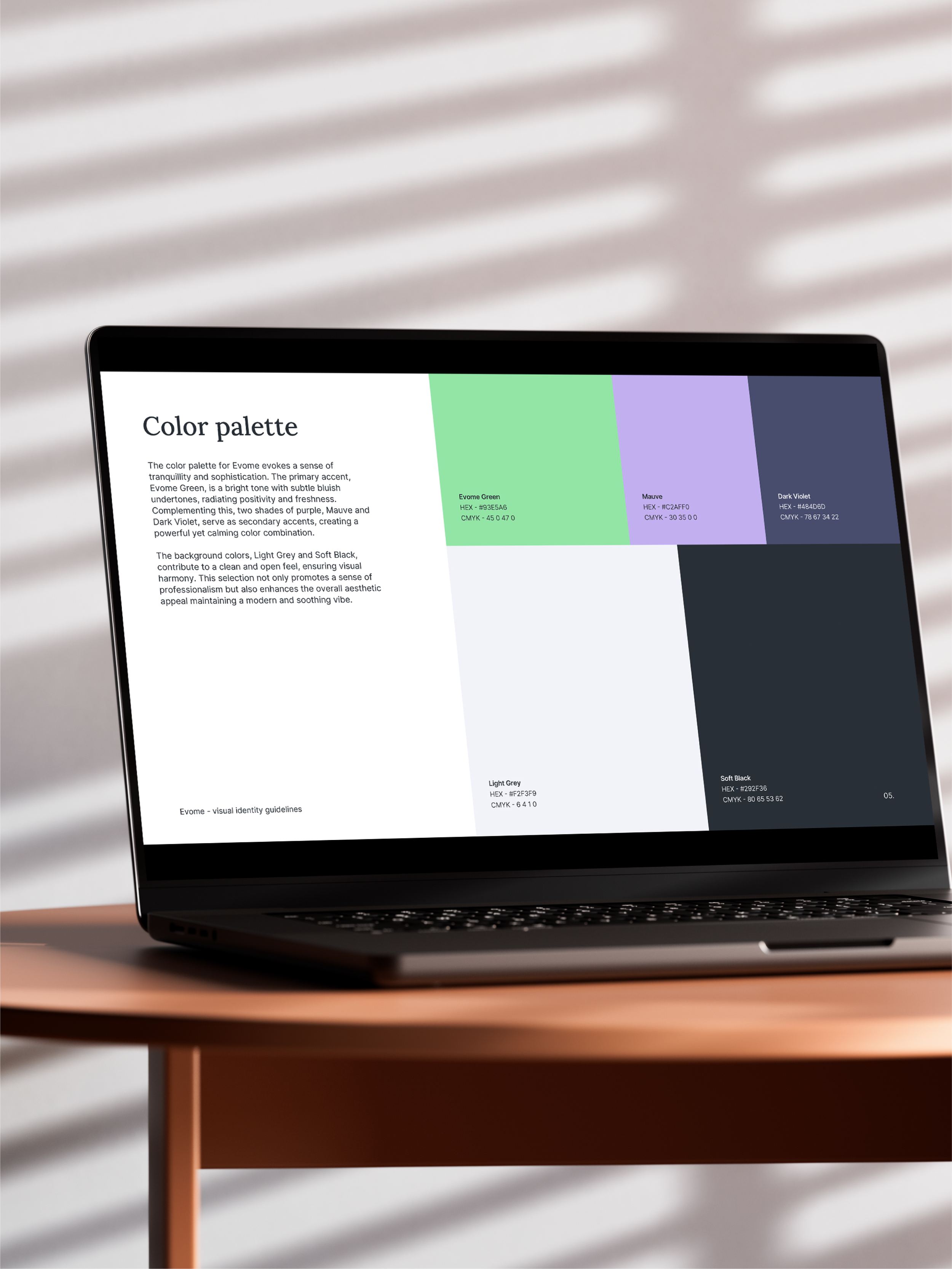
A serif typeface conveys sophistication and calm, while "Evome Green"—paired with mauve and dark violet—balances freshness with depth. The illustrations, characterized by simple forms and a serene style, expand the identity and clearly distill complex concepts.